This is a collection of my digipak research and my digipak design developments
What is a Digipack CD?
Printed card packaging that is often used for CDs and/or DVDs.
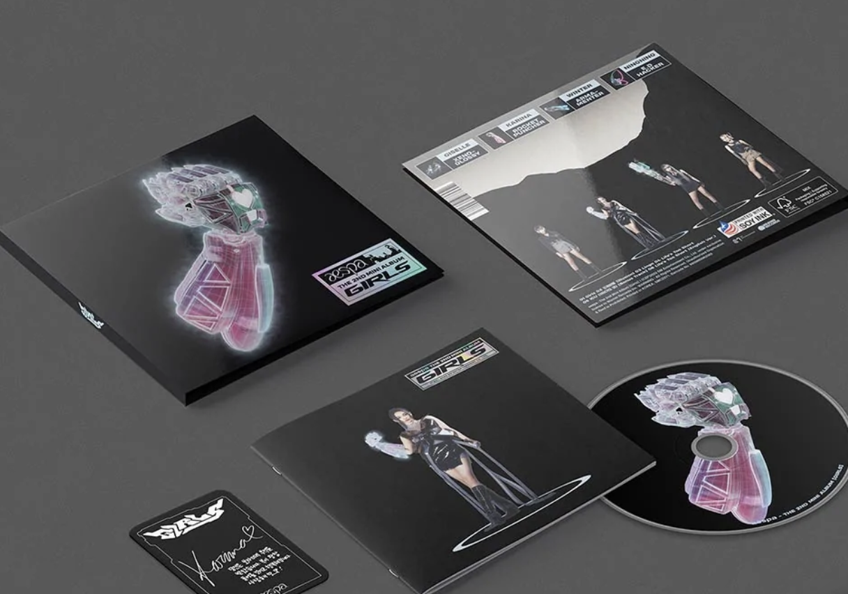
Aespa's Girls - The 2nd Mini Album


Aespa released 4 version (one version for each members) of digipack for their 2nd mini album, Girls. The design of their digipack is highly related to Aespa's virtual world, Kwangya. The cover includes 3D designs of Aespa's weapons (as seen on the music video) and holographic elements to make it more look more futuristic. The back side includes an image of the 4 Aespa members to add star appeal. The colors used on the digipack are mostly similar to Aespa's brand color which are cyan and magenta to increase the consistency between each versions. The Girls digipack is consisted of inclusions such as folded poster, photocard, poster and a lyric book. Random photocards are inserted to physical album packages, so fans will never know what they're going to get. Their inclusion in albums is seen by many as a strategy employed by K-pop companies to sell more copies, thus helping the artist chart higher. Having different versions of the digipack cover is also one of the marketing strategy so each fans will buy more than one of the same album to complete their collection.
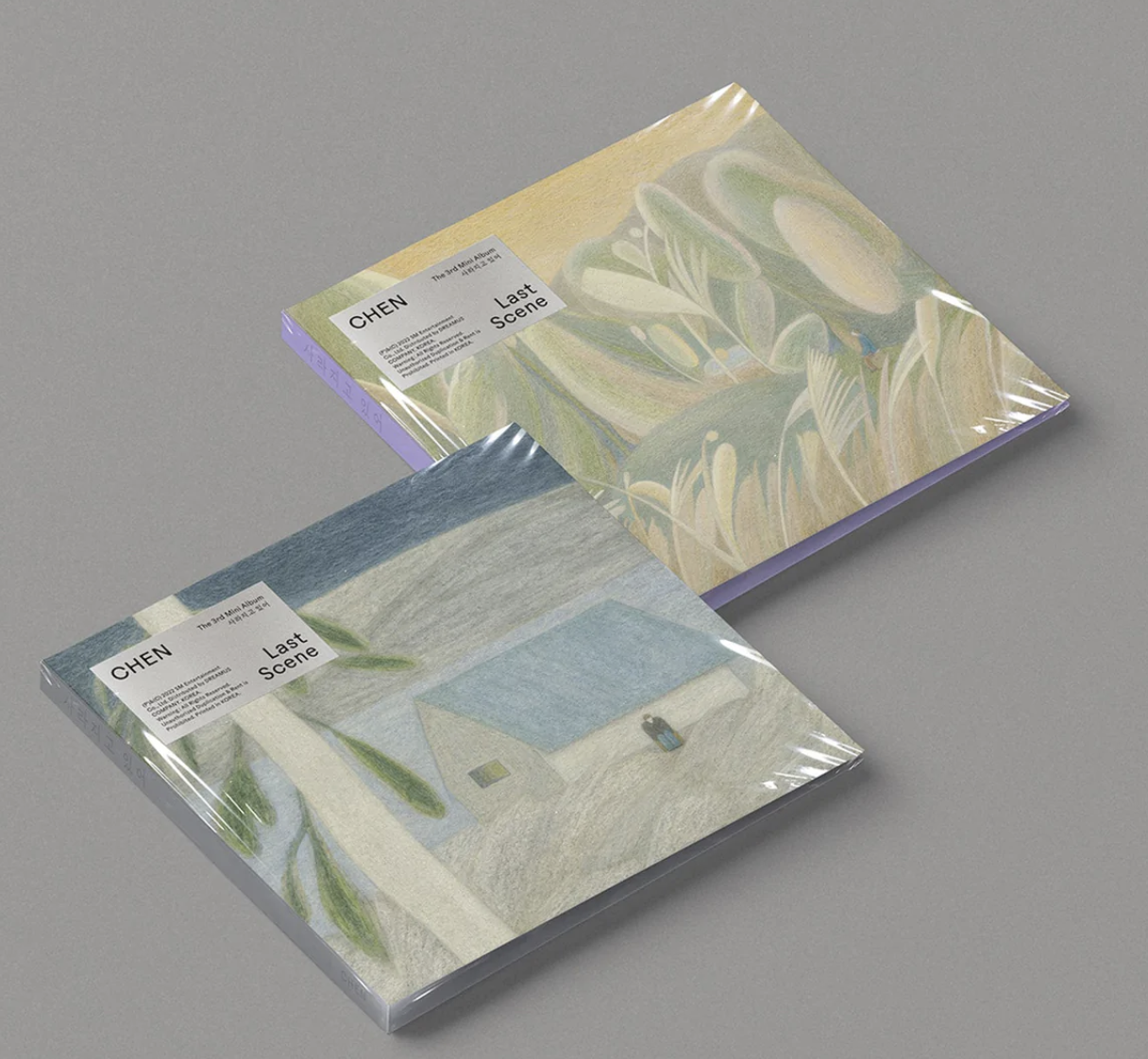
Chen's Last Scene - The 3rd Mini Album


This is a digipack album for a ballad album. Unlike many other digipack, this digipack doesn't include any image of the artist on the cover. Instead, they used an art piece which suits the song as the image, as most ballad song listeners focuses more on the tracks instead of the artist. Chen have consistently used artworks as his album covers previously too. They offer 2 different cover designs which different art pieces to add variety and boost sales. The CD also includes an artwork with a similar art style. The digipack includes a 28 page booklet, 1 random photocard, 1 special photocard.
Billie Eilish's WHEN WE ALL FALL ASLEEP WHERE DO WE GO?
The front cover of this digipack is the album cover and the back cover includes the tracklist, barcode, logos of related companys and other details on a black background. This digipack is marketed as "limited edition." Unlike most western digipack which only includes the CD, this digipack includes other merchandises such as posters, temporary tattoo and stickers.
Pink Floyd's The Wall back cover
A usual digipack back cover would include the album tracklist, credits, a copyright notice and a barcode like the example above. Back covers are usually more simple than the front cover.
Album Cover Research
The album cover features a comic styled animated drawing and a comic styled text of the album title. It only includes two colors, hot pink and black.
Jannabi have consistently used paintings and illustrations for his album covers. This album cover is a painting of trees which matches the overall vibe of their tracklist.
I like the simplicity of this album cover. It's an image of a couple in the beach. The photographer uses a long shot to focus on the scenery.
(title: Dried Flowers)
This album cover is a photo of a woman (who appeared on the music video) holding a bouquet of dried flowers. The photo has an old school nostalgic warm filter, it may be taken using a film camera.
This album cover includes the tracklist for the album. I like the bold blue color used in this cover, as it suits the tracks (R&B Hip Hop). The cover also include pictures taken in the summer.
This album cover features a picture of both the singer doing a similar pose. The picture is taken using a fisheye lens and film camera to create an old school aesthetics.
Moodboard
Sketches and Ideas
[ front ]
[ back ]
I created a logo for my artist with the font “alagard,” an 8-bit font which is usually found in video games from the 90s which matched the theme. The logo is in purple to as it is eve's official color.
Title card
I designed a title card for the music video intro with a script font (“aloja”). I chose the font as handwritten to have a feeling of femininity and it seems more personal.
Digipack Development
This was my first try on using the digipak mockup
[ Front & Back Cover ]
[ Inside ]
Cover
[ Inside ]
[ Digipack Final Mockup ]
This segment was taken Erin's blog https://kanna-regentsmedia.blogspot.com/2023/01/digipack-research.html
Examples were collected by Erin
We were inspired by the Tailor Swift and Billie Eilish albums on the top left for our digipak. The color and overall vibe is very inspired by the two. The Heize album on the left is inspired the logo placement of eve's name on the bottom left of the album.


Comments
Post a Comment